

THE NO BOLLOCKS
BUSINESS LIBRARY
Every article here cost me something — money, time, reputation, or all three. This isn’t recycled LinkedIn advice or motivational fluff. It’s real business intelligence built from 25 years of building companies, deploying over £1B in capital, and learning the hard way so you don’t have to. Pick a category. Start reading.

Trending Now
 Wealth Reports
10 min
Wealth Reports
10 min
Kaleb Cooper Net Worth: Wealth Blueprint
How Kaleb Cooper built an estimated £5m in five years: the Clarkson's Farm breakout, number-one books, sell-out tours and a real farming business.
 Wealth Reports
10 min
Wealth Reports
10 min
James May Net Worth: Wealth Blueprint
How James May built an estimated £22m: Top Gear salary years, Grand Tour equity, the widest solo-presenting slate of the trio and an Amazon…
 Wealth Reports
11 min
Wealth Reports
11 min
Sylvester Stallone Net Worth: Wealth Blueprint
How Sylvester Stallone built a ~$400m fortune: the Rocky gamble, Rambo and Expendables, top star salaries, a late-career TV reinvention, and the Rocky IP…
 Wealth Reports
10 min
Wealth Reports
10 min
Logan Paul Net Worth: Wealth Blueprint
How Logan Paul built an estimated $150m: YouTube, the Mayweather fight, WWE, the boom-and-bust Prime stake, and the wins and losses of maximalist monetisation.
 Wealth Reports
10 min
Wealth Reports
10 min
Lewis Hamilton Net Worth: Wealth Blueprint
How Lewis Hamilton built an estimated £290m: record F1 salaries, the Ferrari move, a huge endorsement book, a Denver Broncos stake and a diversified…
Business Ideas & Validation
 Business Ideas & Validation
10 min
Business Ideas & Validation
10 min
How to Pitch a Business Idea Without Sounding Clueless
Pitching a business idea? Use a clear 60-second structure, real proof, and simple numbers to sound credible and close with a strong next step.
 Business Ideas & Validation
13 min
Business Ideas & Validation
13 min
Business Name Ideas: How to Name Your New Venture Properly
Find business name ideas that fit your positioning, pass domain and trademark checks, and validate fast with simple tests to avoid costly rebrands.
 Business Ideas & Validation
12 min
Business Ideas & Validation
12 min
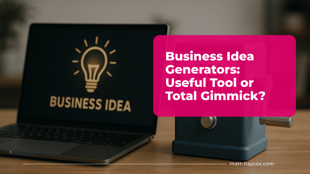
Business Idea Generators: Useful Tool or Total Gimmick?
Use a business idea generator the smart way: turn outputs into testable offers, validate in 7–14 days, and avoid generic ideas that won’t sell.
 Business Ideas & Validation
12 min
Business Ideas & Validation
12 min
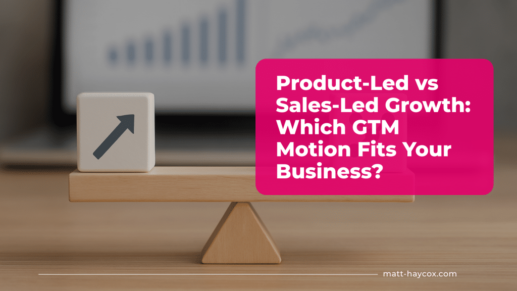
Product-Led vs Sales-Led Growth: Which GTM Motion Fits Your Business?
Product-led vs sales-led growth: learn how to choose the right GTM motion, validate fast with tests, and protect margin with simple guardrails.
 Business Ideas & Validation
14 min
Business Ideas & Validation
14 min
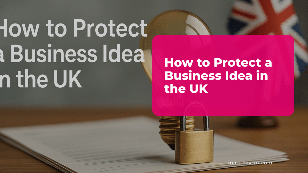
How to Protect a Business Idea in the UK
Learn how to protect a business idea UK founders rely on using trademarks, NDAs and copyright, while validating fast and keeping momentum.
 Business Ideas & Validation
14 min
Business Ideas & Validation
14 min
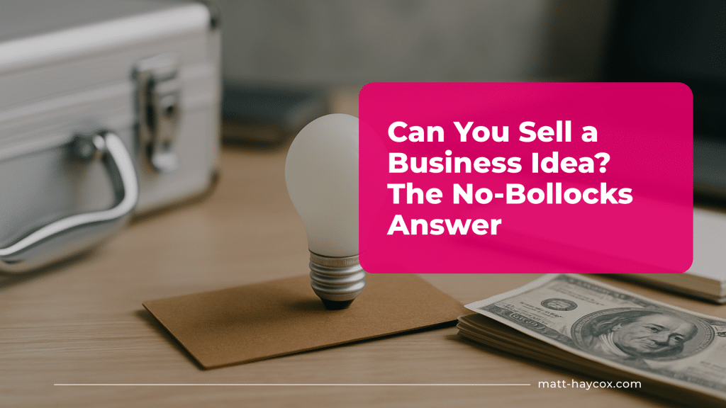
Can You Sell a Business Idea? The No-Bollocks Answer
Can you sell a business idea? Learn how to turn concepts into sellable assets with proof, traction, and rights using a 7-day validation plan.
 Business Ideas & Validation
13 min
Business Ideas & Validation
13 min
I Have a Business Idea But No Money. Now What?
Turn a business idea into proof and cash flow fast with a 7–14 day plan: craft an offer, validate demand, pre-sell, and bootstrap without…
 Business Ideas & Validation
13 min
Business Ideas & Validation
13 min
How to Develop a Business Idea Into a Real Plan
Turn a foggy business idea into an operating plan. Define your customer, offer and pricing, then validate demand in 7–14 days with small tests.
 Business Ideas & Validation
16 min
Business Ideas & Validation
16 min
Golf Business Ideas: Turn Your Passion for the Game into Profit
Discover effective golf business ideas that prioritise customer needs for lasting success in the industry.
 Business Ideas & Validation
13 min
Business Ideas & Validation
13 min
Education Business Ideas: Teach What You Know
You can build a serious business in education without a massive audience, a fancy platform or a teaching degree. The hard bit is picking…
 Business Ideas & Validation
12 min
Business Ideas & Validation
12 min
IT & Software Business Ideas: Build Scalable Digital Solutions
Explore top software business ideas to validate and build profitable digital solutions with insights from entrepreneur Matt Haycox.
 Business Ideas & Validation
13 min
Business Ideas & Validation
13 min
Construction Business Ideas: Practical Models for Skilled Trades
Discover practical construction business ideas to help skilled tradespeople scale their success without sacrificing work-life balance.
Funding & Finance

How to Build a Pricing Model You Can Defend on Sales Calls
Learn how to create a pricing model you can defend on sales calls, confidently justify your rates, and close deals without undervaluing your service.
13 min · Dec 2025
Working Capital Explained (Founder-Friendly)
Working capital is one of those finance terms that sounds like it belongs in a spreadsheet-only world—but for founders, it’s a day-to-day survival metric.…
8 min · Dec 2025
Profit vs Cashflow: Why Many Profitable Businesses Still Go Broke
Learn the difference between profit vs cash flow and why even profitable businesses can run out of cash if financial management isn’t handled correctly.
10 min · Dec 2025
What Is EBITDA?
what is ebidtaIf you have ever looked at a company’s financials and wondered how profitable it is from its core operations, you have probably…
6 min · Dec 2025
How to Build a Financial Plan for Your Business
Learn how to build a business financial plan to forecast income, manage expenses, and guide your company toward sustainable growth.
8 min · Dec 2025
Business Credit Scores: How They Work & How to Improve Yours
A strong business credit score helps lenders, suppliers, and landlords trust your company without relying on your personal credit. For founders, that trust translates…
9 min · Dec 2025
Financial KPIs Every Founder Should Track
Discover the key financial KPIs every founder should track to monitor business health, improve decisions, and drive sustainable growth.
9 min · Dec 2025
How to Build a Cash Runway
Learn how to build a cash runway, plan your finances, and ensure your business stays funded and sustainable during growth or tough times.
7 min · Dec 2025
Debt vs Equity Funding: Pros & Cons
Explore debt vs equity funding, their pros and cons, and learn which financing option best suits your business growth and investment goals.
8 min · Dec 2025
How to Prepare Financials for Investors
When investors ask for your numbers, they are not looking for a perfect accounting thesis—they want clear, credible investor financials that explain how the…
7 min · Dec 2025
How to Build a Data Room for Fundraising
A well-built fundraising data room can make (or break) your momentum with investors. The goal is simple: answer diligence questions before they’re asked, reduce…
8 min · Dec 2025
How to Create a Revenue Forecast
A revenue forecast is a practical estimate of how much money your business will bring in over a future period (usually monthly, quarterly, or…
8 min · Dec 2025Go-to-Market & Positioning
 Latest Articles
13 min
Latest Articles
13 min
Are Holiday Lets Still a Profitable Business Idea?
Are holiday lets still profitable in 2026? Learn the real maths on occupancy, costs, regulation and quick tests to validate holiday let profitability.
 Go-to-Market & Positioning
16 min
Go-to-Market & Positioning
16 min
International Market Entry Strategies: How to Expand Without Guesswork
Use proven international market entry strategies to validate demand in 7–14 days, choose the right route, and protect margin with smart guardrails.
 Go-to-Market & Positioning
12 min
Go-to-Market & Positioning
12 min
Market Entry Methods: Which Route to Market Actually Makes Sense?
Choose market entry methods that match your economics. Validate a route to market in 7–14 days, protect margin, and scale with confidence.
 Go-to-Market & Positioning
12 min
Go-to-Market & Positioning
12 min
Value Proposition Canvas: How to Use It Without Getting Lost in Theory
Use the value proposition canvas to turn customer evidence into a clear offer, validate in 14 days, and price with margin-friendly guardrails.
 Go-to-Market & Positioning
13 min
Go-to-Market & Positioning
13 min
How to Do Market Research for a Business Idea
Learn how to do market research for a business idea in 7–14 days. Validate demand, pricing, and competitors with real buyer signals before you…
 Go-to-Market & Positioning
13 min
Go-to-Market & Positioning
13 min
Positioning Case Studies: How Small Brands Won Big by Going Niche
Discover how small brands succeeded by going niche and refining their messaging for clarity and impact.
 Go-to-Market & Positioning
12 min
Go-to-Market & Positioning
12 min
The One-Page Go-To-Market Plan: Fast Framework for Busy Founders
If your GTM is spread across 12 docs, it won’t run under pressure. You don’t need a bigger strategy deck, you need decisions you…
 Go-to-Market & Positioning
11 min
Go-to-Market & Positioning
11 min
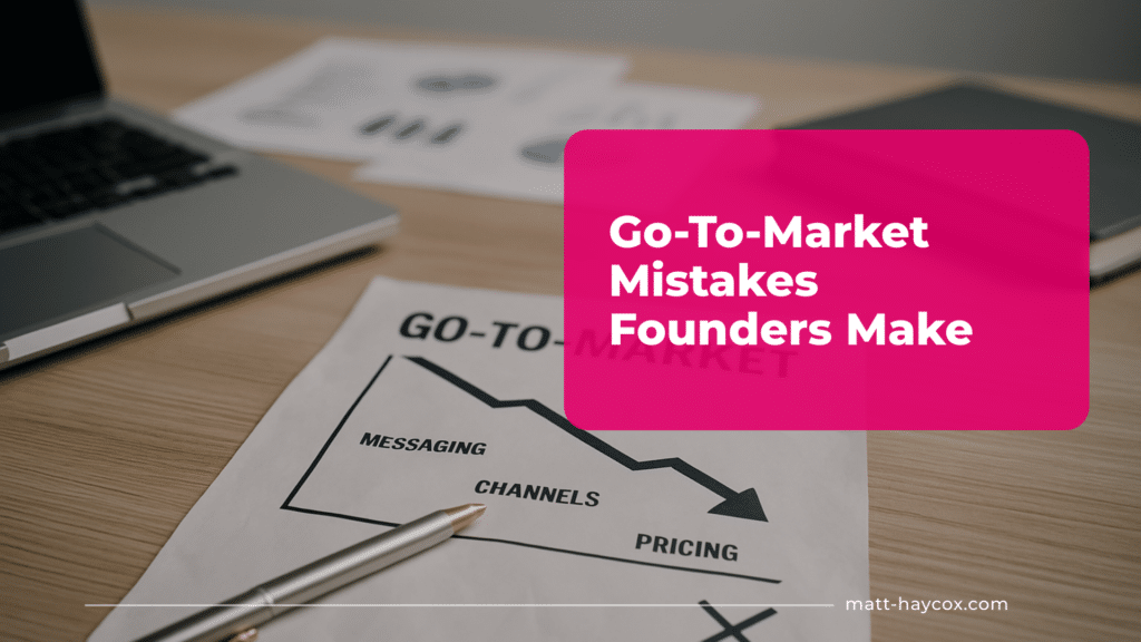
Go-To-Market Mistakes Founders Make
Go to market is simply how you turn a clear problem into predictable revenue: who you sell to, what you promise, how you reach…
 Go-to-Market & Positioning
12 min
Go-to-Market & Positioning
12 min
Building Trust Before You Launch: Pre-Market Positioning Tactics
Most founders treat pre launch marketing as ‘getting the word out’. Operator reality: it’s a controlled process of collecting proof that reduces perceived risk…
Go-to-Market & Positioning
12 min
Story-Based Positioning: Sell with Emotion, Not Just Features
Learn how storytelling in marketing can elevate your brand and drive sales without competing on price.
 Go-to-Market & Positioning
12 min
Go-to-Market & Positioning
12 min
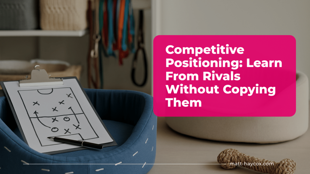
Competitive Positioning: Learn From Rivals Without Copying Them
Discover effective competitive positioning strategies to enhance sales without resorting to imitation. Learn from the best.
 Go-to-Market & Positioning
12 min
Go-to-Market & Positioning
12 min
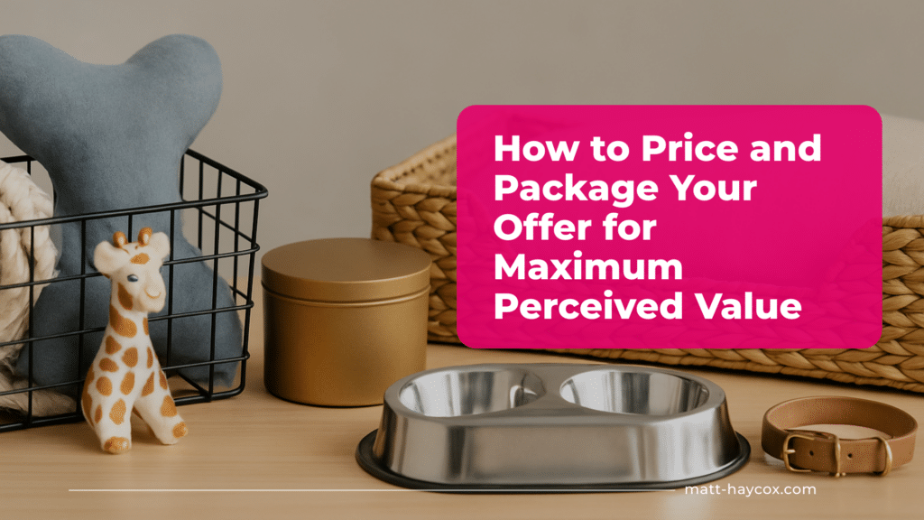
How to Price and Package Your Offer for Maximum Perceived Value
Learn to price and package your offer confidently to enhance perceived value and appeal to your target audience.
Latest Articles

How to Pitch a Business Idea Without Sounding Clueless
Pitching a business idea? Use a clear 60-second structure, real proof, and simple numbers to sound credible and close with a strong next step.
10 min · Jul 2026
Top 12 Contract Maker Platforms to Create Agreements Faster
Compare 12 contract maker platforms for faster drafting, approvals, collaboration and version control across MSAs, SOWs, renewals and addenda.
5 min · Jun 2026
Business Name Ideas: How to Name Your New Venture Properly
Find business name ideas that fit your positioning, pass domain and trademark checks, and validate fast with simple tests to avoid costly rebrands.
13 min · Jun 2026
Business Idea Generators: Useful Tool or Total Gimmick?
Use a business idea generator the smart way: turn outputs into testable offers, validate in 7–14 days, and avoid generic ideas that won’t sell.
12 min · Jun 2026
Are Holiday Lets Still a Profitable Business Idea?
Are holiday lets still profitable in 2026? Learn the real maths on occupancy, costs, regulation and quick tests to validate holiday let profitability.
13 min · Jun 2026
International Market Entry Strategies: How to Expand Without Guesswork
Use proven international market entry strategies to validate demand in 7–14 days, choose the right route, and protect margin with smart guardrails.
16 min · Jun 2026
Mobile Business Ideas for Tradespeople and Service Pros
Mobile business ideas for tradespeople and service professionals with low-cost ways to test demand, win clients, and run a service business on the road…
8 min · Jun 2026
Equipment Every Restaurant Owner Needs to Open
The restaurant equipment you actually need to open a restaurant in the right order, from compliance kit to cooking lines to cash handling, without…
8 min · Jun 2026
Market Entry Methods: Which Route to Market Actually Makes Sense?
Choose market entry methods that match your economics. Validate a route to market in 7–14 days, protect margin, and scale with confidence.
12 min · Jun 2026
UK Market Entry Strategy: How to Launch Into the UK Properly
Build a UK market entry strategy that wins trust fast. Validate demand in 14 days with a sharp wedge, proof assets, and paid pilots…
12 min · Jun 2026
Customer Acquisition Strategy: How to Get Your First Real Customers
Build a customer acquisition strategy that wins your first real customers fast with a tight audience, irresistible offer, proof stack, and follow-up system.
14 min · Jun 2026
Product-Led Growth: When the Product Should Do the Selling
Learn when product-led growth works, build onboarding and pricing that convert, and validate activation and retention fast with 7–14 day tests.
11 min · Jun 2026Legal, Risk & Compliance
 Legal, Risk & Compliance
12 min
Legal, Risk & Compliance
12 min
Compliance for Remote Teams: Hiring, Data & Operations Across Borders
A guide to remote work compliance: manage hiring, data, and operations across borders while staying legally and operationally secure.
 Legal, Risk & Compliance
12 min
Legal, Risk & Compliance
12 min
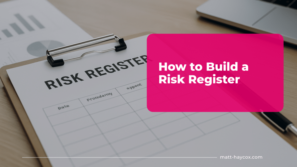
How to Build a Risk Register
Learn how to build a risk register to identify, assess, and manage risks effectively for your business.
 Legal, Risk & Compliance
12 min
Legal, Risk & Compliance
12 min
Data Breach Response Plan: What to Do in the First 24 Hours
A step-by-step data breach response guide covering what to do in the first 24 hours to limit damage, protect data, and meet compliance requirements.
 Legal, Risk & Compliance
13 min
Legal, Risk & Compliance
13 min
Supplier Agreements: Reduce Risk in Your Supply Chain
Learn how supplier agreements can reduce risk in your supply chain and use a supplier contract template to protect your business.
 Legal, Risk & Compliance
13 min
Legal, Risk & Compliance
13 min
NDA Essentials: When You Need One
Discover NDA essentials and use a practical NDA template to safeguard your business secrets and sensitive information.
 Legal, Risk & Compliance
13 min
Legal, Risk & Compliance
13 min
Employment Contracts: What Must Be Included (UK & UAE)
UK & UAE employment contract requirements: what must be included to protect employees, meet legal standards, and ensure clarity.
 Legal, Risk & Compliance
12 min
Legal, Risk & Compliance
12 min
Contracts for Freelancers & Agencies: Protect Your Time, Work & IP
Learn how to protect your time, work, and intellectual property with a freelance contract template designed for freelancers and agencies.
 Legal, Risk & Compliance
13 min
Legal, Risk & Compliance
13 min
How to Run a Data Protection Impact Assessment (DPIA)
Discover how to complete a DPIA effectively using a practical DPIA template to protect personal data and stay GDPR-compliant.
 Legal, Risk & Compliance
9 min
Legal, Risk & Compliance
9 min
Website Legal Compliance: Cookies, Disclosures & Policy Requirements
A plain-English guide to website legal requirements: cookies, disclosures and policies, with practical steps to ship compliance fast.
 Legal, Risk & Compliance
10 min
Legal, Risk & Compliance
10 min
Handling Client Disputes: Resolve Issues Without Lawyers
A founder’s guide to resolving client disputes early: triage, evidence, scripts, and settlement tools that protect cash and relationships.
 Legal, Risk & Compliance
9 min
Legal, Risk & Compliance
9 min
How to Create a Statement of Work (SOW) That Prevents Scope Creep
Write a clear statement of work template that stops scope creep, protects margin and speeds sign-off, with examples you can use today.
Risk Management for Founders: Build a Lean System That Prevents Disaster
A founder’s guide to business risk management: simple controls, quick audits, and a 14-day plan for UK & UAE teams.
M&A & EXIT
UK Market Entry Strategy: How to Launch Into the UK Properly
Build a UK market entry strategy that wins trust fast. Validate demand in 14 days with a sharp wedge, proof assets, and paid pilots…
12 min · Jun 2026
Cross-Border M&A (UK ↔ UAE): Legal, Tax & Operational Factors
Explore cross-border M&A strategies, legal factors, and tax implications for UK and UAE businesses to ensure smooth transactions.
14 min · Jan 2026
Buying a Business in the UAE: What Foreign Founders Must Know
Learn key factors for buying a business in the UAE, including licensing, ownership rules, and deal structures to avoid pitfalls.
15 min · Jan 2026
How to Prepare Your Business for Sale
Prepare business for sale with buyer-grade proof: tighten cash flow, cut owner dependency, document SOPs, and boost valuation with quick tests.
11 min · Jan 2026
Exit Strategy for Business Owners: Plan Your Sale the Smart Way
Discover how to create a sellable business exit strategy that maximises value and minimises risks.
12 min · Jan 2026
How to Sell Your Business for Maximum Value
Learn how to sell a business for maximum value with key strategies on valuation, paperwork, and selecting the ideal buyer.
12 min · Jan 2026
Deal Structuring Basics: Earn-Outs, Clawbacks & Deferred Payments
Master deal structuring for SME exits: negotiate earn-outs, deferred payments and clawbacks with clear rules, control guardrails and fewer disputes.
14 min · Jan 2026
How to Spot Red Flags When Buying a Business
Spot red flags fast when buying a business. Learn to test earnings, cashflow and culture, and hedge business acquisition risks with smarter deal terms.
14 min · Jan 2026
Business Valuation Explained: Multiples, SDE, EBITDA & More
Explore business valuation for SMEs using SDE, EBITDA, and multiples to enhance negotiations and minimise risk effectively.
14 min · Jan 2026
What Is a Letter of Intent (LOI)?
Learn what a letter of intent is and how to use an LOI to set price, timeline and exclusivity, avoid traps, and keep M&A…
13 min · Dec 2025
SME Due Diligence: What Buyers Must Check Before Signing Anything
Verify the money, not the story. Prove earnings, surface risks and lock price, peg, and protections that keep cash safe from day two.
10 min · Dec 2025
Asset Purchase vs Share Purchase: Which Is Right for Your Deal?
Choose asset vs share purchase with clarity: weigh risk, tax and continuity; gather proofs fast; structure offers that protect day-two cash.
9 min · Nov 2025Marketing & Demand Generation
 Latest Articles
12 min
Latest Articles
12 min
Market Entry Analysis: What to Check Before You Launch Somewhere New
Run a fast market entry analysis in a week: validate demand, pricing, CAC, competitors and compliance with low-regret tests before you launch.
 Marketing & Demand Generation
13 min
Marketing & Demand Generation
13 min
Founder-Led Marketing: When You Are the Brand
Founder led marketing: Learn how to become the face of your brand, build trust, and drive growth through your personal influence.
 Marketing & Demand Generation
14 min
Marketing & Demand Generation
14 min
Affordable Marketing Tools for Small Businesses in 2026
Marketing tools for small business: Affordable solutions in 2026 to improve marketing efficiency and drive growth.
 Marketing & Demand Generation
13 min
Marketing & Demand Generation
13 min
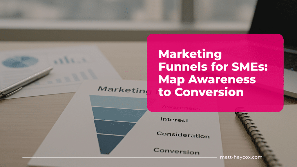
Marketing Funnels for SMEs: Map Awareness to Conversion
Discover a marketing funnel strategy that helps SMEs turn prospects into paying customers through a structured journey.
 Marketing & Demand Generation
12 min
Marketing & Demand Generation
12 min
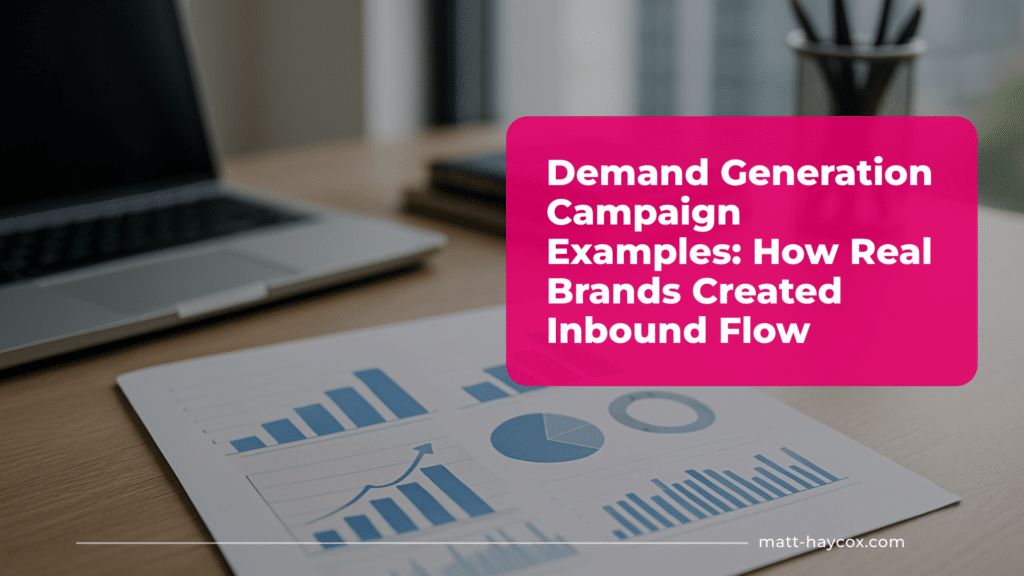
Demand Generation Campaign Examples: How Real Brands Created Inbound Flow
Learn from demand generation examples of real brands that successfully built inbound lead flow and boosted revenue.
 Marketing & Demand Generation
15 min
Marketing & Demand Generation
15 min
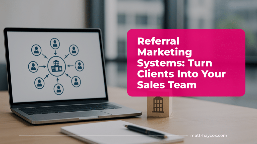
Referral Marketing Systems: Turn Clients Into Your Sales Team
Referral marketing strategy: Learn how to turn your clients into a powerful sales team that drives consistent growth.
 Marketing & Demand Generation
12 min
Marketing & Demand Generation
12 min
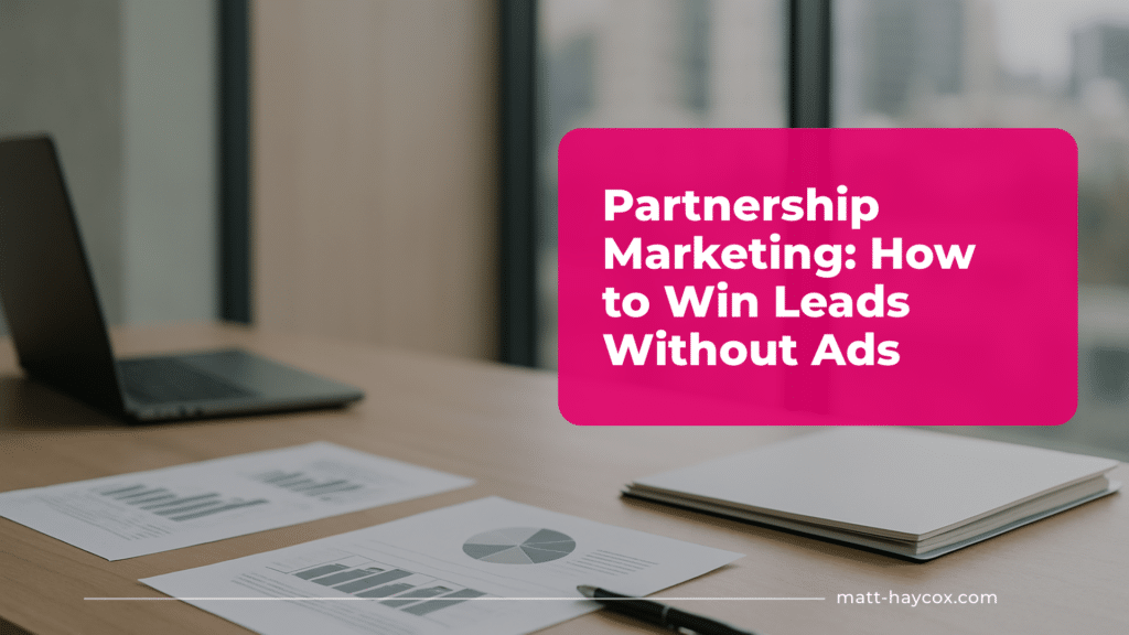
Partnership Marketing: How to Win Leads Without Ads
Discover partnership marketing strategies that help you generate leads, build authority, and grow your business without paid ads.
 Marketing & Demand Generation
12 min
Marketing & Demand Generation
12 min
PR for Small Businesses: Earn Coverage Without a Big Agency
Discover PR for small business strategies that get your brand noticed and generate media coverage on a budget.
 Marketing & Demand Generation
11 min
Marketing & Demand Generation
11 min
Email Marketing for Service Businesses: From Cold to Conversion
Turn cold leads into customers with email marketing for small business strategies built for service businesses.
 Marketing & Demand Generation
13 min
Marketing & Demand Generation
13 min
Podcast Marketing for Coaches and Experts: Turn Listeners Into Clients
Turn podcast listeners into clients with a practical podcast marketing strategy built for coaches and experts.
 Marketing & Demand Generation
12 min
Marketing & Demand Generation
12 min
Building a Personal Brand That Generates Demand
Building a personal brand that generates demand using proven personal brand marketing strategies to attract leads, trust, and authority.
 Marketing & Demand Generation
10 min
Marketing & Demand Generation
10 min
LinkedIn Marketing for Consultants and Advisors
Practical LinkedIn marketing strategy for consultants and advisors who want more inbound leads, not vanity likes.
Operations & Systems

B2B Customer Acquisition Strategy: How to Win Better Clients
Build a repeatable B2B customer acquisition strategy: target high-value accounts, choose trust channels, and turn founder-led sales into predictable pipeline.
12 min · May 2026
How to Build a Low-Drama Operations Culture
A practical guide to creating an operations culture that reduces conflict, boosts accountability, and improves execution.
12 min · Jan 2026
How to Track Tasks Across a Growing Team
Learn how to improve task management across a growing team with simple systems that keep work visible and on track.
12 min · Jan 2026
How to Scale Delivery Without Hiring Too Fast
Learn proven ways to scale delivery without hiring too fast and protect margins as your business grows.
13 min · Jan 2026
Daily, Weekly, Monthly Ops Cadence for Small Teams
A practical guide to creating an operations cadence for small teams without meetings overload or micromanagement.
13 min · Jan 2026
How to Reduce Operational Bottlenecks in a Small Business
Operational bottlenecks slow growth. Discover practical ways small businesses can remove bottlenecks and scale smoothly.
12 min · Jan 2026
How to Standardise Your Client Experience
A step-by-step guide to standardise processes and build a reliable, repeatable client experience that scales.
12 min · Jan 2026
How to Build a Delivery Dashboard
Create a delivery dashboard that gives real-time insights into orders, logistics, and delivery efficiency.
13 min · Jan 2026
Automation vs Delegation: What Should You Do First?
Automation vs delegation: learn which tasks to automate or delegate first to save time and improve productivity.
12 min · Jan 2026
Top 10 Best Tools for Business Operations
Find the best operations tools to simplify management, automate tasks, and improve day-to-day operations.
13 min · Jan 2026
Operations KPIs Every Founder Should Track
Learn the most important operations KPIs to monitor performance, optimise workflows, and drive smarter decisions.
13 min · Jan 2026
How to Reduce Mistakes in Your Business
Reduce mistakes effectively: practical tips for business owners to avoid errors and optimise operations.
12 min · Jan 2026People & Culture
 People & Culture
7 min
People & Culture
7 min
The Best Ways to Incentivise a Remote or International Team
Incentivising people you never see is harder than it looks. Office perks, hallway thank-yous, and the energy of a shared room do not travel…
 Latest Articles
13 min
Latest Articles
13 min
Podcast Marketing for Coaches and Experts: Turn Listeners Into Clients
Most podcasts don’t fail because the audio’s bad, they fail because there’s no commercial plan behind the mic. If you’re going to invest your…
 Latest Articles
12 min
Latest Articles
12 min
How to Create a Company Handbook Quickly
If your team keeps asking the same questions, you don’t have a people problem, you’ve got an information problem. A company handbook fixes that…
How To Create A Culture Of Accountability
Most teams talk about accountability when something has already gone wrong. Targets are missed, customers are annoyed, and everyone has a story about why…
 People & Culture
12 min
People & Culture
12 min
Micro-Management vs Coaching: What Founders Must Understand
Learn the difference between micro-management and coaching, and what founders must know to build effective, empowered teams.
 People & Culture
12 min
People & Culture
12 min
The First 90 Days: How to Set New Hires Up for Success
Discover how to onboard new hires effectively and help them thrive during their first 90 days on the job.
 People & Culture
12 min
People & Culture
12 min
How to Build a Positive Workplace Culture
Discover practical strategies to create a positive workplace culture where employees feel valued, motivated, and supported.
 People & Culture
14 min
People & Culture
14 min
Leadership Styles: What Works Best in Small Teams
Learn the most effective leadership styles for small teams and how to inspire, guide, and get the best from your people.
 People & Culture
13 min
People & Culture
13 min
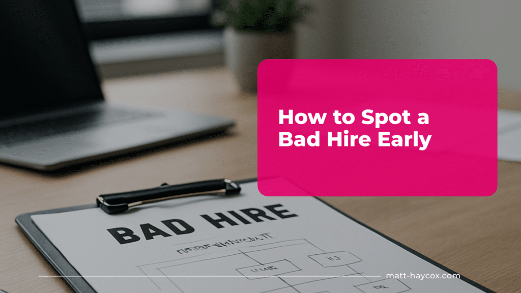
How to Spot a Bad Hire Early
Learn how to spot a bad hire early by recognising warning signs and taking action before they impact your team’s performance.
 People & Culture
16 min
People & Culture
16 min
How to Run Weekly Team Meetings That Aren’t Pointless
Learn how to run a weekly team meeting that adds value, using a clear team meeting agenda that keeps everyone focused.
 People & Culture
12 min
People & Culture
12 min
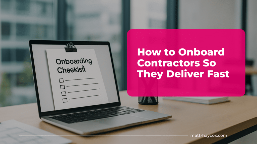
How to Onboard Contractors So They Deliver Fast
Discover proven contractor onboarding steps that help new contractors deliver results quickly and efficiently.
 People & Culture
11 min
People & Culture
11 min
How to Build a Team Structure That Scales
A practical guide to building a scalable team structure using a strong organisational structure that grows with your business.
Pricing & Monetisation

Hidden Costs: What Founders Forget to Include in Their Pricing
Learn pricing cost calculation to avoid hidden expenses founders often forget when setting prices for their products or services.
12 min · Jan 2026
Profit Margins 101: How to Ensure Your Pricing Works
Ensure your pricing works with tips on business profit margin, helping you grow profitably and sustainably.
11 min · Jan 2026
How to Add Upsells Without Being Sleazy
Upsell ideas made simple: strategies to offer more value to clients while increasing your revenue.
11 min · Jan 2026
Should You Charge Per Project or Per Month?
Project vs monthly pricing explained: find the right approach to grow your business and keep clients happy.
12 min · Jan 2026
How to Price Coaching and Advisory Services
Coaching pricing made simple: tips to value your expertise, win clients, and maximise revenue.
12 min · Jan 2026
How to Price Development & Tech Services
Most dev and tech shops don’t have a pricing problem, they have a packaging problem. They sell hours, absorb chaos, then wonder why margin…
12 min · Jan 2026
How to Price UX/UI, Design and Creative Services
Discover how to price UX/UI, design, and creative services confidently with proven design pricing techniques.
14 min · Jan 2026
The Best Pricing Models for Agencies
Learn the top agency pricing models to maximise profits, satisfy clients, and grow your business effectively.
12 min · Jan 2026
Pricing Mistakes Founders Make
Discover the biggest pricing mistakes founders make and learn how to fix them before they hurt your business.
14 min · Jan 2026
How to Write a Pricing Page That Converts
Struggling with your pricing page? Discover how to write a pricing page that builds trust and increases conversions.
13 min · Jan 2026
Packages vs Hourly: Which Makes You More Money?
Packages vs hourly: pricing packages effectively can increase your earnings and attract the right clients.
12 min · Jan 2026
How to Price Your Offer When You’re New (Beginner-Friendly)
Pricing for beginners made simple: strategies to launch your offer, attract clients, and grow revenue from day one.
14 min · Jan 2026Sales & Client Acquisition
 Latest Articles
14 min
Latest Articles
14 min
Customer Acquisition Strategy: How to Get Your First Real Customers
Build a customer acquisition strategy that wins your first real customers fast with a tight audience, irresistible offer, proof stack, and follow-up system.
 Sales & Client Acquisition
11 min
Sales & Client Acquisition
11 min
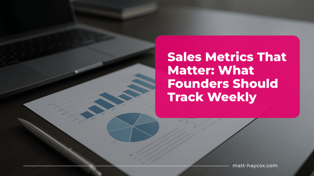
Sales Metrics That Matter: What Founders Should Track Weekly
Track the right sales metrics weekly to optimise performance, spot opportunities, and drive consistent growth.
 Sales & Client Acquisition
12 min
Sales & Client Acquisition
12 min
Micro-Offers: How to Sell a ‘Tiny Yes’ Before the Big One
Learn how micro offers can help you sell a ‘tiny yes’ first, building trust and paving the way for bigger sales.
 Sales & Client Acquisition
12 min
Sales & Client Acquisition
12 min
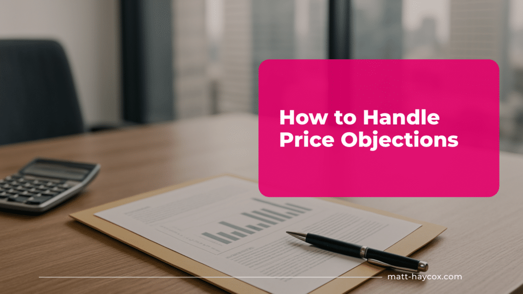
How to Handle Price Objections
Handling price objections made simple: strategies to respond, demonstrate value, and win clients without lowering prices.
 Sales & Client Acquisition
13 min
Sales & Client Acquisition
13 min
Sales Coaching for Small Business Owners: What to Learn First
Small business sales coaching made simple: master the key techniques that drive conversions and grow your business.
 Sales & Client Acquisition
13 min
Sales & Client Acquisition
13 min
How to Win Back Lost Deals
Win back clients effectively by reconnecting, addressing objections, and showing renewed value to lost prospects.
 Sales & Client Acquisition
12 min
Sales & Client Acquisition
12 min
Client Retention: Keep Clients Longer Without Extra Work
Client retention strategies that help you keep clients longer without extra work—build loyalty and grow your business.
 Sales & Client Acquisition
13 min
Sales & Client Acquisition
13 min
How to Build a Referral Engine That Brings Clients Every Month
Build a referral engine with proven referral marketing techniques that turn happy clients into a continuous lead source.
 Sales & Client Acquisition
12 min
Sales & Client Acquisition
12 min
Sales Tips for Entrepreneurs Who Aren’t ‘Salespeople’
Struggling with selling? These sales tips for entrepreneurs help you close deals, build confidence, and grow your business.
 Sales & Client Acquisition
13 min
Sales & Client Acquisition
13 min
Consultative Selling for Service Providers: Stop Pitching, Start Solving
Consultative selling strategies for service providers: focus on helping clients, not pitching, to win more business.
 Sales & Client Acquisition
12 min
Sales & Client Acquisition
12 min
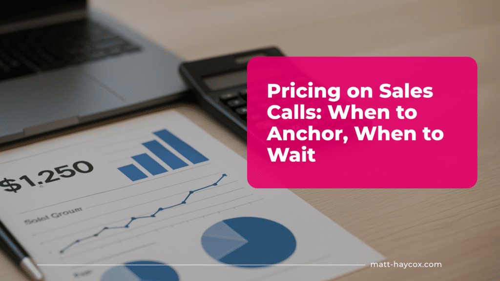
Pricing on Sales Calls: When to Anchor, When to Wait
Master your sales pricing strategy: learn when to anchor your price on calls and when it’s better to wait.
 Sales & Client Acquisition
11 min
Sales & Client Acquisition
11 min
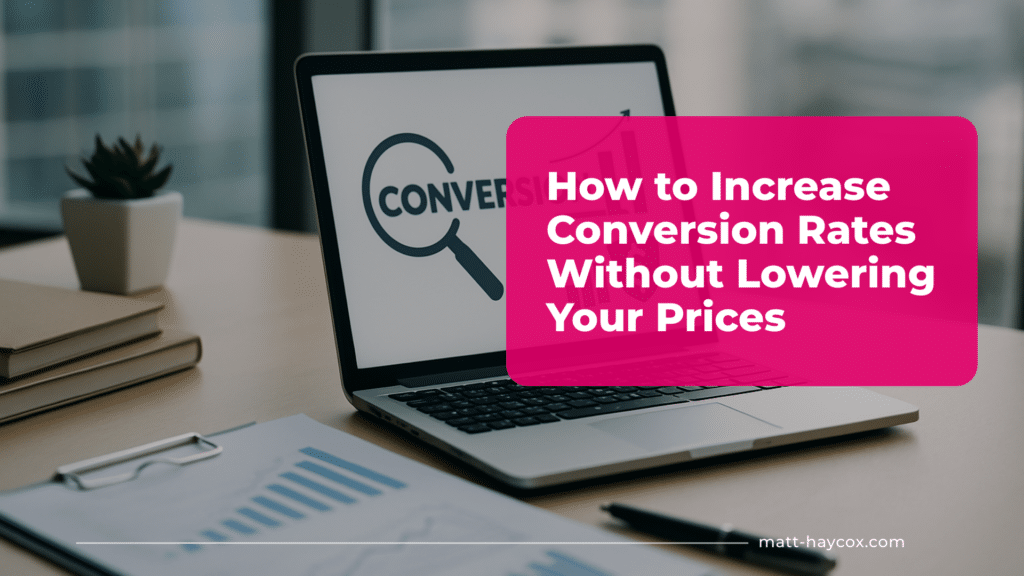
How to Increase Conversion Rates Without Lowering Your Prices
Learn how to increase sales conversion without cutting prices to boost revenue with smarter strategies and better customer experiences.
Scale & Growth
Product-Led Growth: When the Product Should Do the Selling
Learn when product-led growth works, build onboarding and pricing that convert, and validate activation and retention fast with 7–14 day tests.
11 min · Jun 2026
Product-Led Growth Metrics: What to Track Before You Scale
Track the product-led growth metrics that prove activation, time to value, retention, and expansion before you scale acquisition or hire sales.
13 min · Jun 2026
Sales-Led Growth: Why Selling Still Beats Waiting for Sign-Ups
Use sales-led growth to win high-ticket B2B deals fast. Build a founder-led sales system in 7 days, validate pricing, and close paid pilots.
11 min · Jun 2026
How a Business Coach in Dubai Builds Sustainable Growth
If you are searching for a business coach Dubai leaders can trust, it is often because growth feels harder than it should. Revenue may…
15 min · Jan 2026
Business Development Growth Strategy: Frameworks, Examples, and Step‑by‑Step Plan
A business development growth strategy is often the hidden line between companies that grow in a steady way and those that jump from deal…
14 min · Jan 2026
The Flywheel Strategy: Growth That Compounds Over Time
Discover how the flywheel strategy can generate sustainable growth without relying on constant spending.
12 min · Jan 2026
Business Growth Problems: What Breaks First
Discover how to identify and address business growth problems effectively for sustainable success. Insights from Matt Haycox.
12 min · Jan 2026
How to Prepare Your Business for Rapid Growth
A practical guide to preparing a business for growth, covering systems, teams, and processes needed to scale quickly and sustainably.
11 min · Jan 2026
How to Scale to Multiple Locations Without Losing Quality
A practical guide to building a business expansion plan that lets you scale to multiple locations while maintaining quality and consistency.
11 min · Jan 2026
How to Build a Scalable Business Model for New Regions
Going into a new region can make your numbers look bigger while your margins quietly die. The fix is not ‘more marketing’, it’s building…
12 min · Jan 2026
International Expansion Checklist (UK ↔ UAE Edition)
Cross-border growth can look simple on a slide deck, then destroy your margin when licensing drags, payments fail, and you misread how decisions actually…
13 min · Jan 2026
Business Expansion: How to Enter New Markets Safely and Strategically
Explore business expansion strategies to enter new markets safely, minimise risks, and grow your company strategically and sustainably.
11 min · Jan 2026Want More Than Articles?
Growth HQ gives you direct mentorship from Matt, recorded courses, weekly live sessions, and a network of operators who are actually building — not just reading about it.
Join Growth HQ